Tag Archives: google

Lego, Imagination and Work

Last week I was lucky enough to go on a session about using Lego as a means of facilitating creativity and/or strategy.  It wasn’t the full ‘Lego Serious Play‘ experience – but it piqued my curiosity in this and was interesting so I thought I’d share – and share some fun photos I took of the serious play we were enganged in. Serious Play is a technique that Lego have developed for using their bricks, etc in the office for, erm, work.

The session I went to was run by the Digital Research Unit based in Huddersfield.

The idea is that using the bricks can help people use their imaginations and using the bricks to express complex ideas and relationships in 3D, describe complicated relationships and also give you a chance to use your hands (which, in theory, helps some people engage their brains more).  They can also be used in brainstorming – and many of you saw an example of how this can be done in an exercise one of my colleagues ran a  few months ago.

We worked through a process where we used the Lego to model our own role; then how we operate within that role; the wider organisation etc, until we built up a large model of how our roles fit together and fit into the BBC.  We also built aspects of ourself that we don’t bring to work and used these to do some introspection into how we might (or might not) change the way we operated, etc.

The main idea was to get people to work through their individual identity, then team identity and then the wider environment/landscape their role and organisation exists in.

My role - in Lego!
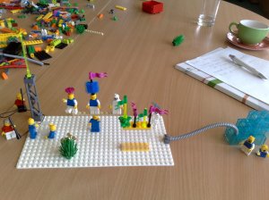
My role - in Lego!

How I operate in my role - In Lego!
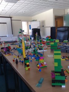
How I operate in my role - In Lego!

A 'model' BBC

A 'model' BBC

I was really captivated by how much the Lego opened up the conversations we were having.  ‘Playing’ allowed us to put alot of our normal conversational conventions to the side and forced us to explain things in a simple way that wasn’t offensive or overly formal because we were using simple tools for explaining our ideas.  I also thought about people I work with who aren’t necessarily comfortable expressing themselves verybally who could use this as a means of showing instead of speaking.  And, best of all, building something before you explain it makes you think before you speak; and let’s face it, we could all do more of this.

Effectively we were building stories.  Stories about who we are, where we work and how we do it.  But this storytelling could be expanded to help build stories for use in programme making or other content.  I recently read an article in Wallpaper* (which unfortunately isn’t online) about how architects are building stories and fantasy into some of the new work that’s being done in that field because they’re trying to embrace our contemporary need for more narrative experiences that blur the difference between real and fantastic.

I think this is especially important when you work with digital media – sure everything needs to be functional and simple – but it should also delight and building this delight is the hardest part.  Sure Google search is a wonderful piece of technology, but it latched into not being ‘just another search box’ by having fun and playing with its logo.  I’d hope that in the type of work that I do, that if we start by expressing our ideas with Lego (or other manual tools for that matter) that we might capture some of the fun and fantasy that can get lost along the way.

We’ll see how it goes.  I’ve just installed a few containers full of Lego in meeting spaces for my team to ‘play’ with…

Some more info on Lego in the office/work environment:

http://www.seriousplay.com/

http://www.artlab.org.uk/lego.htm

http://kn.theiet.org/magazine/issues/0903/lego-for-life-0903.cfm

http://mindstorms.lego.com/eng/Tasmania_dest/Default.aspx

Thoughts on MobiThinking’s ‘Best of the Mobile Web’

It was great to get some more recognition for what the team I work in is doing here:

http://mobithinking.com/white-papers/best-and-worst-of-the-mobile-web

Of course, we normally promote our services as bbc.co.uk/mobile – but, MobiThinking are advocates of the .mobi domain, so not really surprising they called us bbc.mobi.  Anyway, praise is always welcome.

Here’s some more information about it (and an interview with the boss!).

Other than being appreciative for the praise they’ve given the site I work on, this report is interesting because because it names great examples and poor examples on the mobile web. So, I decided to take a look at what they thought was some of the best of the rest to see what I thought and look for some inspiration.  I haven’t gone through all of them here – there are alot – but these were some that I really admired and that gave me something to think about.

‘Make Sure It Actually Works’: Winner: ESPN: http://www.espn.mobi

Sport is one of the most popular things the BBC does on mobile and I think we’re lucky we’re not in direct competition with ESPN’s site on this front.  The site is incredibly user friendly AND its content is increidbly deep – not an easy balance to get right on mobile.  There’s an incredible amount of linking throuhout the content, which makes player profiles, stats of all sorts, etc easy to access.

‘Solve a Real Problem’: Winners: http://www.nwa.mobi and http://google.mobi (maps)

Simplicity, and doing something useful is key on the mobile web  – users tend to be incredibly task oriented and don’t want much interuption and both of these do this.  NWA’s site (for an american airline – not the band NWA!) is deceptively simple and straightforward looking considering how much fucntionality it provides.

‘Maintain Laser Focus’: Winner: http://www.fidelity.mobi and http://www.obamamobile.mobi

When I first saw this category name, I thought I’d missed the boat on the memo about how to turn your mobile into a laser gun.  While the little boy inside me was disappointed, I was happy to see that it was talking about highly targetted services with one mission at their heart.

I talk to alot of web producers who are used to working to create deep, rich experiences on the web, with an unlimited canvas to work on, where users have the luxury of time and space and the comfort of their home or office to explore sites.  The opposite is true on mobile – when you’re standing in the rain (hey, this IS London) trying to find that one tiny piece of information you need, the last thing you want to do is explore or browse one page more than you need to.  Fidelity clearly provides this for its busy banker target audience.  ‘Do one thing and do it well.  Don’t try to do everything you can do on the ‘full-fat’ web.’ is something I tell people frequently.

Content is King… but in small bites : Winner: http://mobile.nytimes.com

I’ve always loved The New York Times and just about everything about it and their mobile site is no exception.  Simple and elegant, its got some great features others should envy.  Pagination that works really well for mobile users, send to another mobile feature (US only, sadly),  resized graphics and photos (which most sites strip out), and some podcasts that really serve mobile user needs.  Some of their navigation is clunky, but the site is so slick it hardly matters.

Meeting Karen Groenink from Google Mobile

A few weeks ago I had the pleasure of meeting Karen Groenink a user experience designer from Google Mobile where I hosted her presenting and answering questions for us at the BBC.  Thanks to BBC Training and Development for organising it!

Karen has worked on a number of different products in the Google family as a mobile expert and it was great to hear the way she’s tackling problems that my team are facing as well.  Some of her presentation was even spookily like one I give on mobile (coincidence, not stealing) – for example we both have slides proclaiming “Mobile is Different!”

The best thing I took away from her presentation was a catch phrase I’m going to keep in the back of my head as much as possible:

“Digital products are rude.”

Easy, simple and true.  How many times have you had a warning message that won’t stop popping up that you don’t understand?  That’s a rude error message – not incorrect, but actually so annoying its rude.

She also talked alot about general principals for user-centred design warning about both trying to “design a car for everyone” as well as “designing for edge cases” – both of which can bring about the death of a piece of work.

Excitingly, she alluded to the fact that Google are looking at doing something with voice-activated serach – which could be really cool if it works.  I’m somewhat skeptical of voice-activated services because I’ve used them before with limited success. Voice dialling never got it quite right (and is a bit wierd socially when you have to say “Call Mom” out loud on a bus) and Spinvox, while generally good, transcribes my name as “Satan” instead of “Jason” which resulted in my old boss getting messages like “Hi, It’s Satan.  Are you coming to this meeting?”  All that said, mobiles started out as phones and few services take advantage of that, so its interesting to see that a bright spark I work with dug up this announcement of an iPhone app that does voice search today.  It looks its the beginning of what Karen talked about: http://googlemobile.blogspot.com/2008/11/google-mobile-app-for-iphone-now-with.html .

If you get to try it, I’d love to know what you think.  I used to work on the BBC’s search products and know that accuracy is everything and I’m curious to see whether or not the voice recognition can be accurate enough to make sure you get the search results you want.

Update 20 Nov: Voice recognition doesn’t seem to work if you’ve got a UK accent – http://www.telegraph.co.uk/scienceandtechnology/technology/apple/3479305/Google-iPhone-voice-recognition-tool-baffled-by-British-accents.html

This has me thinking (again) about the potential of SMS-based searching.  As I mentioned in a previous post, this has been successful for Minfo in China and I think its another opportunity to take advantage of a behaviour that users are doing on mobile and find easy already.